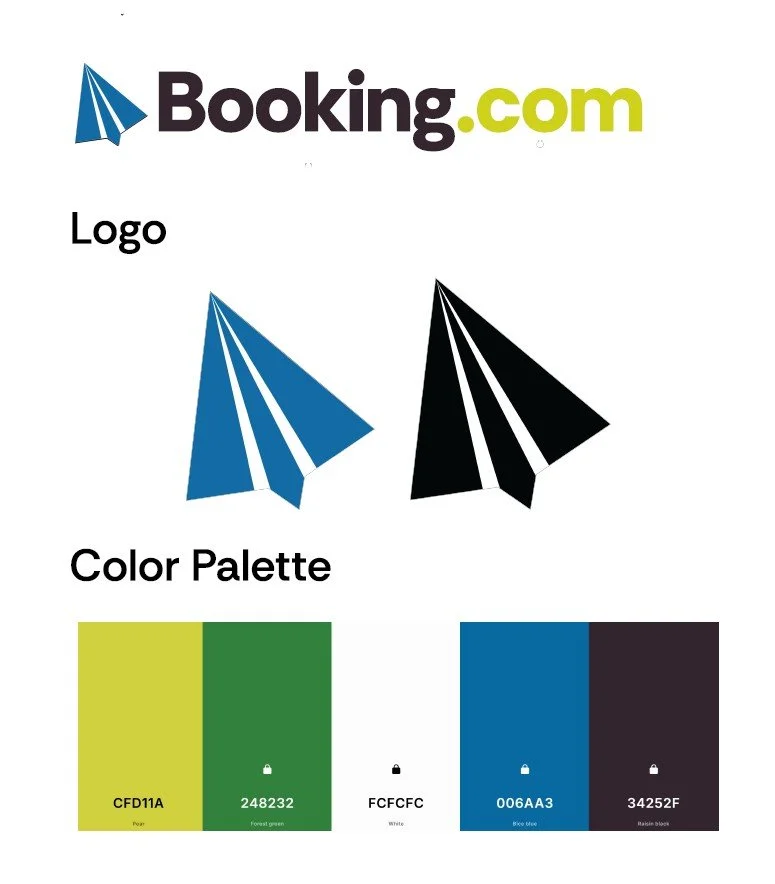
Yet another icon with a double meaning! I wanted to explore the possibilities with booking.com’s branding. I felt like there was some missed opportunity there, so I acted on it! The worldly blue and green with the paper plane/cursor icon would set booking.com apart from other travel sites.
Rethinking Booking.com