
The Project- Create a hypothetical company that makes a positive change, and design their branding Guide.
THE BRANDING GUIDE
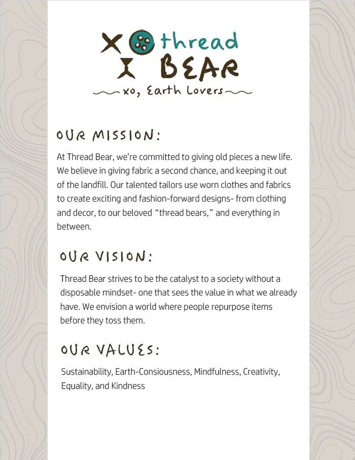
For this project, I wanted to create a company that was all about sustainable fashion. I love a play on words, so when the idea of an upcycling company named “Threadbear” came to mind, I ran with it!
I knew I wanted to incorporate a bear into the logo somehow, but my original sketches were nothing like my final design. In the beginning, I imagined a teddy bear holding a patched up heart. I played around with it for a while, but I found that in this case, simpler was better (as it often is.) I pivoted to a teddy bear face.
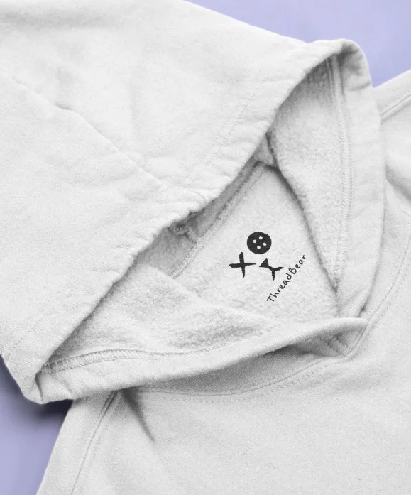
I wanted to bring in the distressed look associated with thrifted clothing into the design of the logo. I started with two X’s for the eyes, but ended up doing one X and a button with a simple mouth shape meant to look like thread. This iterations turned out to be my final logo. However, this design was just the beginning of my branding for this company!
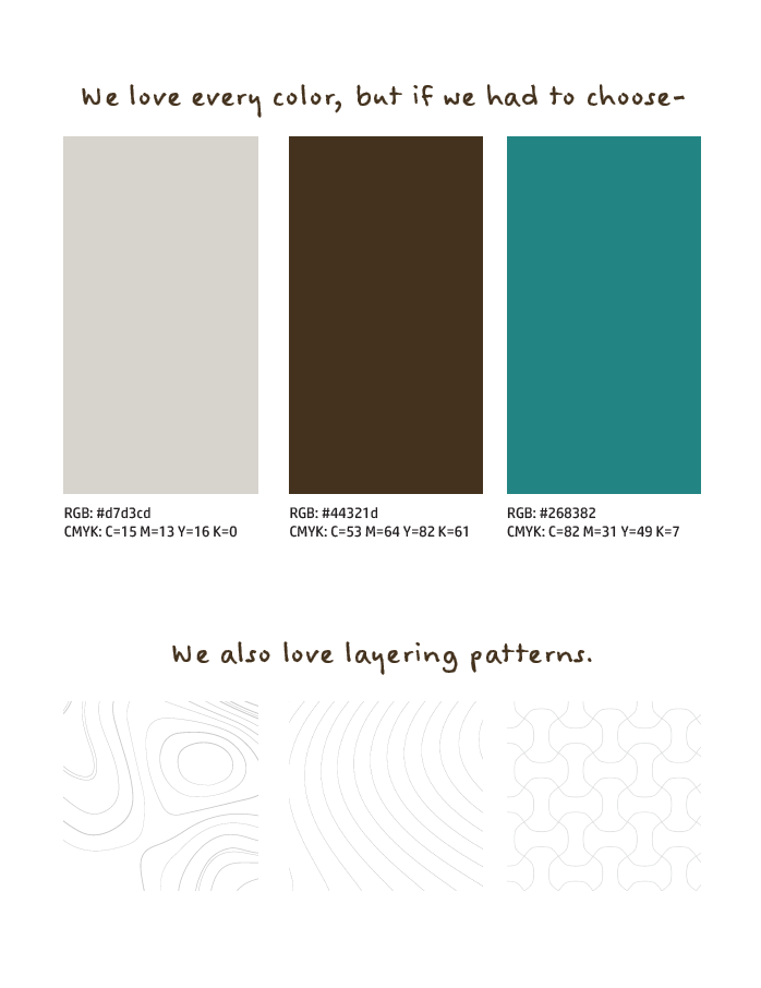
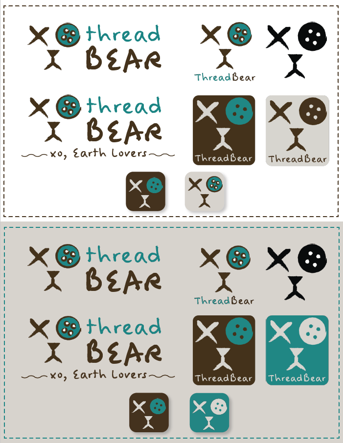
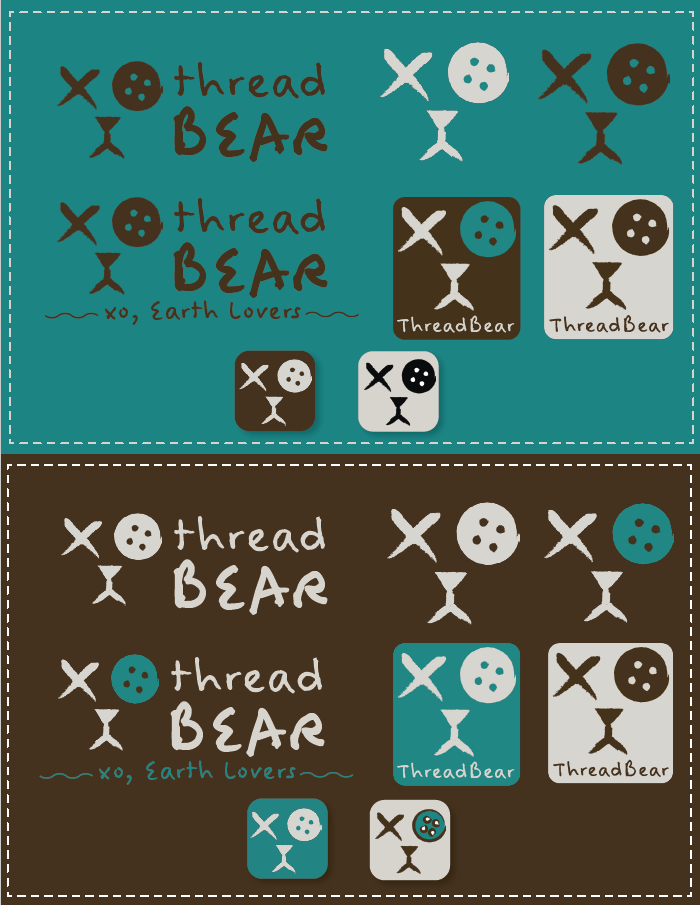
Anytime I can give a design several meanings, I do it! I knew I had to use the “XO” formed by the eyes somewhere else in the company’s branding, so I made it a part of their slogan. Threadbear is earthy, creative, handmade, and perfectly imperfect. I portrayed this in their color story though creams, browns and teal. The muted earth tones combined with the bright and eccentric teal convey Threadbear’s vibe loud and clear!