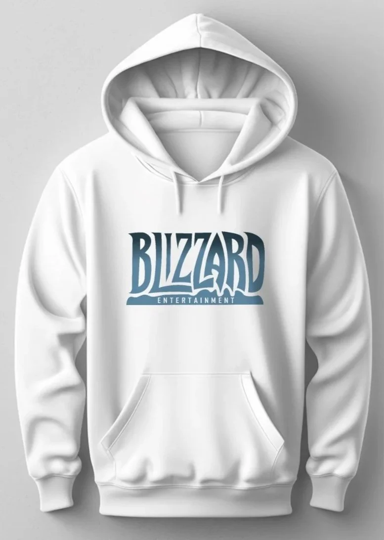
Redesign: Blizzard
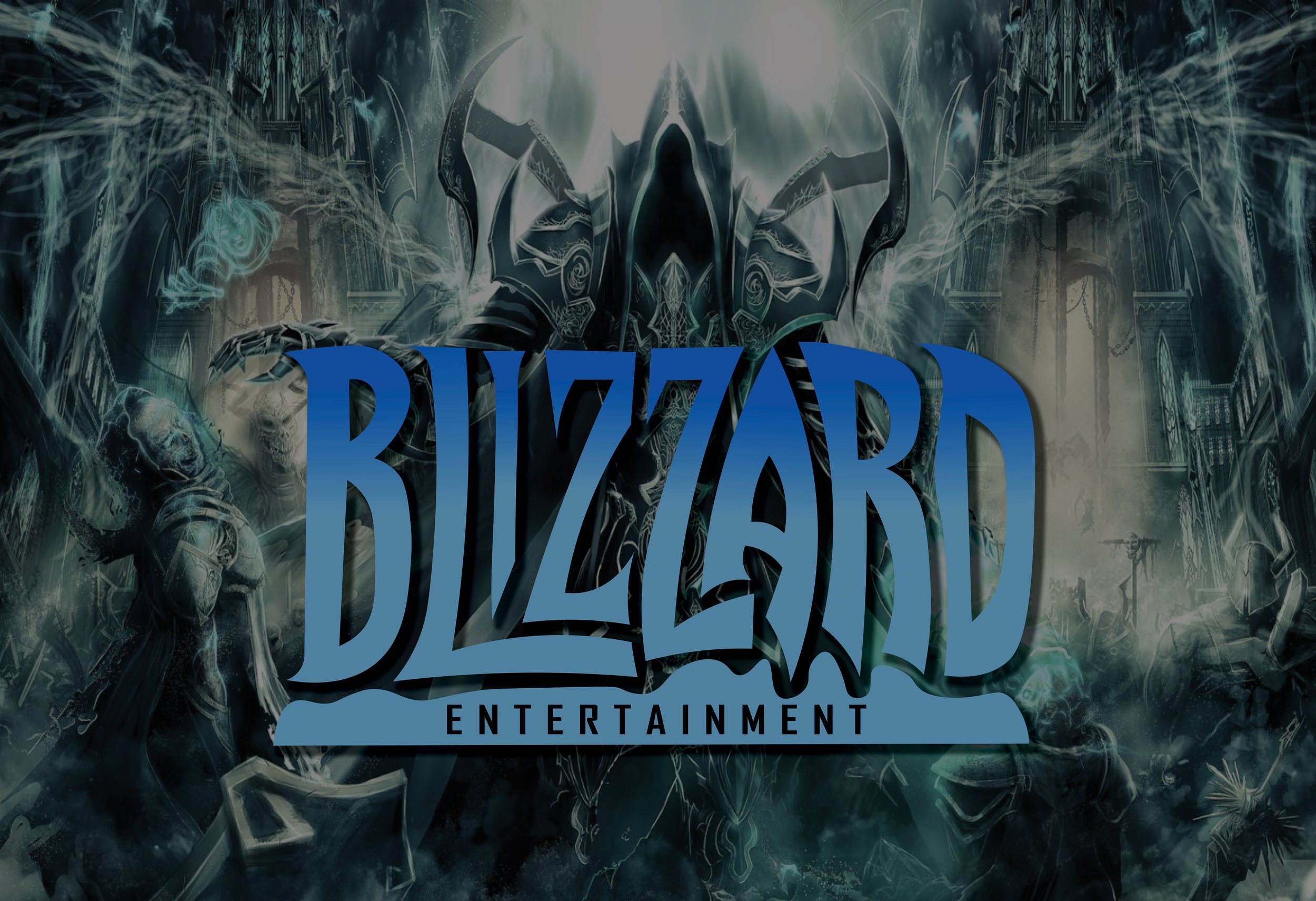
My redesign for Blizzard was an exploration of clarity and versatility in logo design. Blizzard is a gaming company with an interesting yet flawed logo. The logo conveys the icy feel of the name and the digital gaming feel through pixelated, jagged edges. In theory this works great, but it creates a number of issues when scaling down or putting it up against different backgrounds. It loses its clarity, therefore losing its purpose.
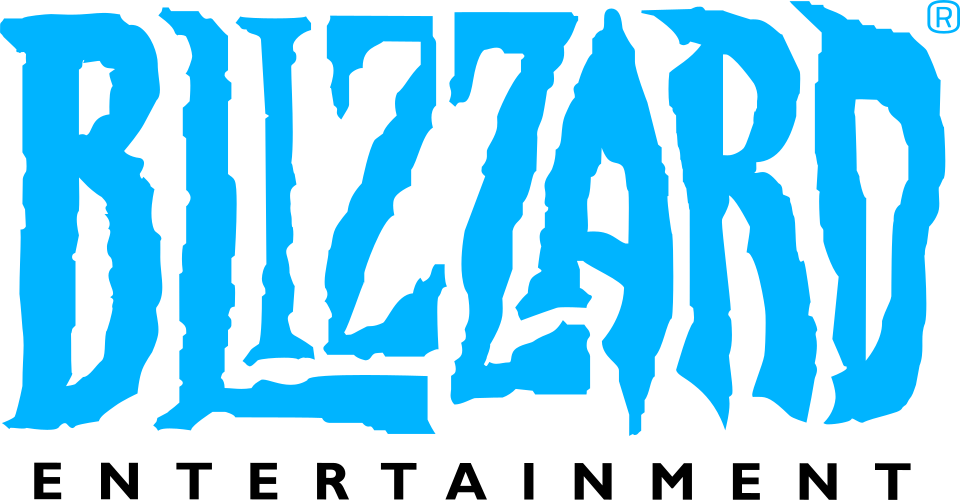
Current Logo
I wanted to challenge myself to retain the general form of the logo, and communicate the same ideas in a different way. I did this through outlining the orinigal logo withough the jagged edges, and keeping emphasis on those sharp icy points. I bought more of the “blizzard” feel in through the snowy hill-like shapes on the bottom bar, and brought the gaming aspect in through the typeface for “Entertainment.”
The most important part of the redesign process is getting feedback. After talking to several people who play Blizzard games, I recieved a very positive response! Below are the different versions of my redesign.