
Redesign: Menards
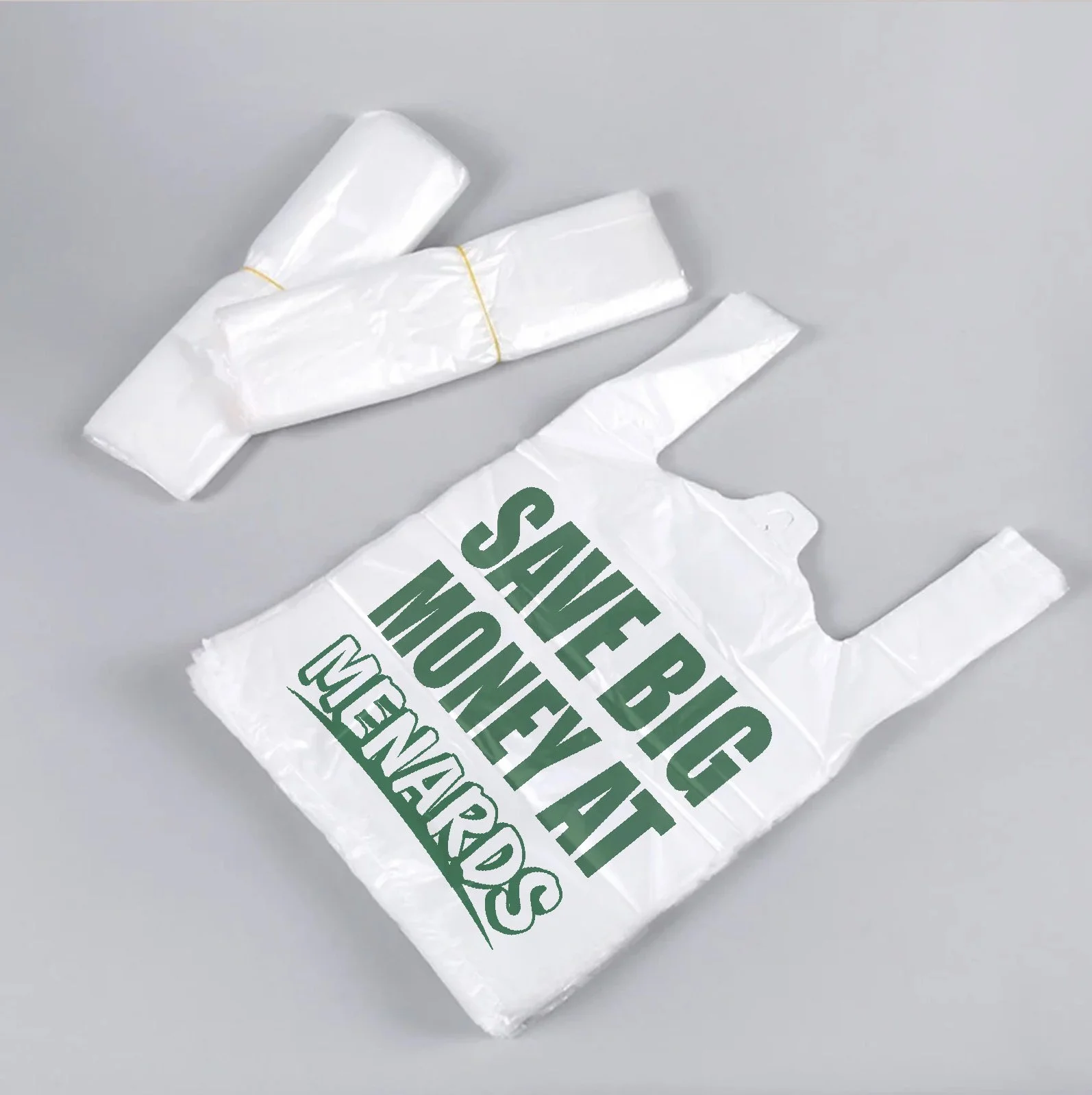
My Menards redesign was focused on finding the balance between preservation and modernization. The typeface and design of the original logo is very dated. in comparison to newer logos, it’s missing that clean and professional feel. However out-dated the design may be though, it still has a certain charm that people have grown attatched to. Logos are the face of a brand’s identity, so it’s incredibly important to hold onto the key feautures people recognize most in a logo. The hard part is figuring out what those feautures are.
My first iteration of this redesign took too much away from the original, which i quickly learned through feedback from friends and family. It was clean and modern, and retained the colors and rounded edges, but it was TOO different.
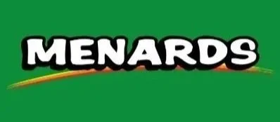
Original Logo
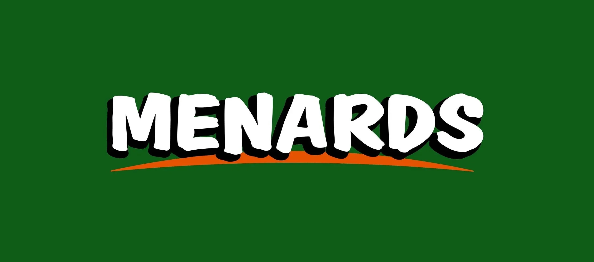
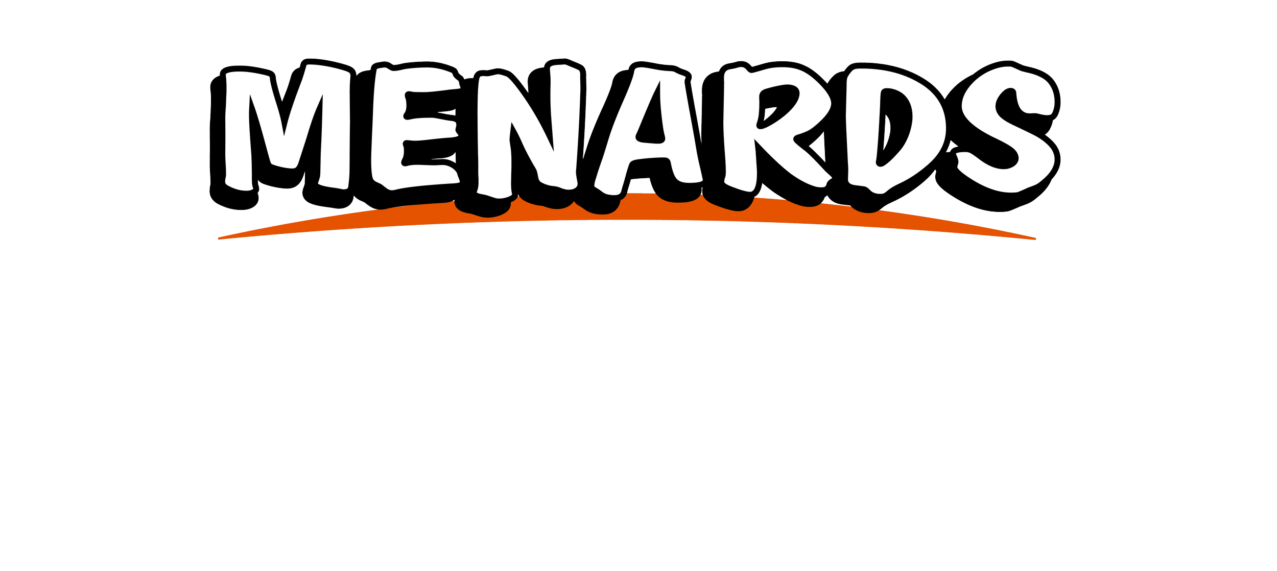
Logo Redesign
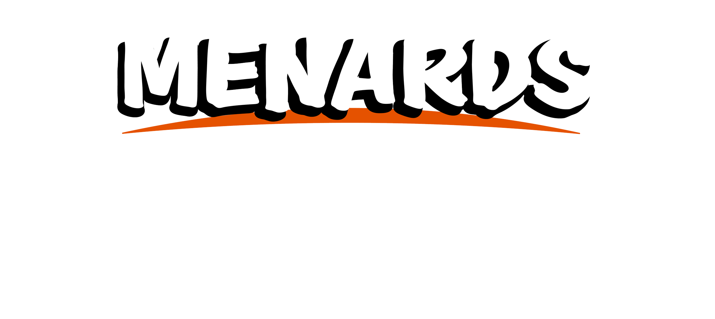
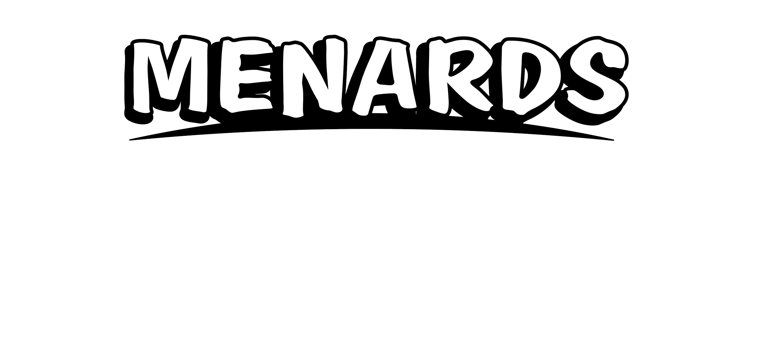
My redesign takes the hand-drawn feel of the original typeface, and turns it into a more structured, marker-drawn one. This retains that crafted, hardware store feel while elevating it to match the quality of other modern day logos. I took the less-is more approach to the underline, combining the 3 colors to just orange and keeping the stroke smooth to match the type. This new iteration was incredibly well-recieved in comparison to my first one, and this process helped me learn what aspects of a logo stick with people. below are store-front comparisons, app icon comparisons, and the several verions of the redesigned Menards logos.



Current App Icon
App Icon Redesign
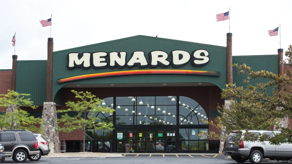
Current Store-Front
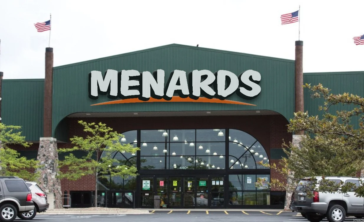
Store-Front Redesign